


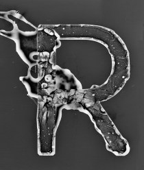
R/Photogram Study
R/Photogram. (Although my photogram studies may look like Photoshop or coding magic, they are actually the product of numerous hours in the darkroom. The prints are scanned and only lightly edited to remove things like dust and fingerprints.
R/Photogram Study
R/Photogram. (Although my photogram studies may look like Photoshop or coding magic, they are actually the product of numerous hours in the darkroom. The prints are scanned and only lightly edited to remove things like dust and fingerprints.

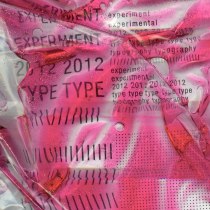
J/Experiment
Pardon the kitchen sink in the background.
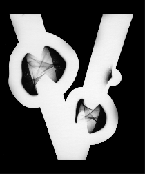
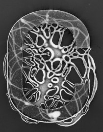
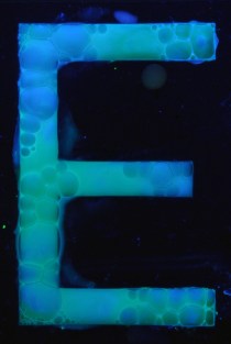
V/Photogram Study
Scanned photograms looped into an animated GIF. Although my photogram studies may look like Photoshop or coding magic, they are the product of numerous hours in the darkroom. The photograms are scanned and only lightly edited to remove things like
V/Photogram Study
Scanned photograms looped into an animated GIF. Although my photogram studies may look like Photoshop or coding magic, they are the product of numerous hours in the darkroom. The photograms are scanned and only lightly edited to remove things like
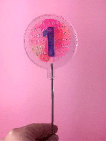
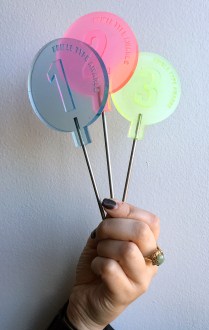
Trophies/2019 Edible Type Awards
Painstakingly hand-crafted. Stainless steel + resin.


TYPE HIKE/North Cascades/Process
Short snippet of process for the North Cascades poster.
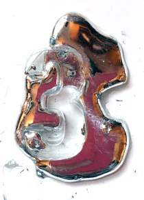
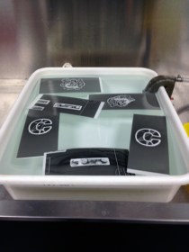
AIGA Nuts + Bolts /// Edible Type Awards
A few photos from the 2015 Edible Type Awards! Congrats to Aubrey (Bodoni o, 1st), Ian (Garamond i, 2nd), and McKinley (Chatype y, 3rd). They took home the coveted stainless steel/resin sucker trophies! A big round of applause for all
AIGA Nuts + Bolts /// Edible Type Awards
A few photos from the 2015 Edible Type Awards! Congrats to Aubrey (Bodoni o, 1st), Ian (Garamond i, 2nd), and McKinley (Chatype y, 3rd). They took home the coveted stainless steel/resin sucker trophies! A big round of applause for all

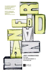
JOEY HANNAFORD POSTER
Joey Hannaford is a very talented designer/artist. You should check her out!
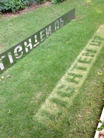
Photograms
I won’t be posting for quite a while. I’ve just started a massive project. Here’s a small sneak peak.
Photograms
I won’t be posting for quite a while. I’ve just started a massive project. Here’s a small sneak peak.


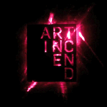
BUILD IT UP TO BURN IT DOWN
I cast a full set of bronze Univers Condensed brands to create this branded poster. The challenges of branding yielded a lot of serendipitous results. Heating the brands evenly is difficult, and the threshold between burning paper and igniting paper
BUILD IT UP TO BURN IT DOWN
I cast a full set of bronze Univers Condensed brands to create this branded poster. The challenges of branding yielded a lot of serendipitous results. Heating the brands evenly is difficult, and the threshold between burning paper and igniting paper


Sink or Swim/Typographic Installation
This piece consists of concrete letters cast from five inch by one inch thick silicone molds, which are then ground and hand sanded to distinct angles. The resulting forms were placed on the sidewalk so that the letterforms appear to be
Sink or Swim/Typographic Installation
This piece consists of concrete letters cast from five inch by one inch thick silicone molds, which are then ground and hand sanded to distinct angles. The resulting forms were placed on the sidewalk so that the letterforms appear to be
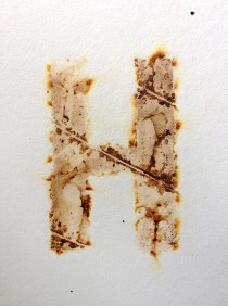
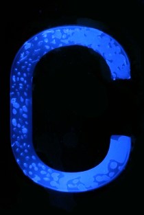
H | Iron/Bronze Brands
Univers Condensed bronze brand studies (burning through different materials).
H | Iron/Bronze Brands
Univers Condensed bronze brand studies (burning through different materials).
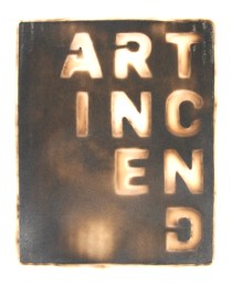
Brand/Art Incend
Many thanks to Daniel McMillan (advanced sculpture student) and Kevin Shunn (Chair, Department of Art) for their help with converting my logotype into a brand.
Brand/Art Incend
Many thanks to Daniel McMillan (advanced sculpture student) and Kevin Shunn (Chair, Department of Art) for their help with converting my logotype into a brand.


Get Back to What Matters
Placed in the high-stress environment of a design department in the midst of the last few weeks of the semester, this fleeting crayon installation is a reminder to get back to what matters — making with your hands, interacting with
Get Back to What Matters
Placed in the high-stress environment of a design department in the midst of the last few weeks of the semester, this fleeting crayon installation is a reminder to get back to what matters — making with your hands, interacting with

It’s Fleeting/Lighten Up Typographic Installation
It’s Fleeting/Lighten Up is a typographic installation designed to reveal a message as it interacts with sunlight. Laser-cut into a sheet of stainless steel bent at a ninety degree angle, the piece presents two phrases, “IT’S FLEETING,” and “LIGHTEN UP.”

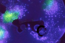
B/Experiment
Typographic explorations with slime mold.

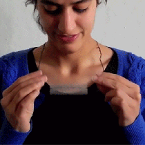
BE BOLD/Typographic Thaumatrope Pendant
Be Bold is a typographic thaumatrope. The horizontal and vertical strokes of geometric letterforms exist on opposing sides of an aluminum pendant. Only through spinning the pendant does the piece confide its secret message. I’m currently working on silver/enamel versions.


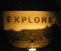
Explore/Typographic Installation
The overhead projector evokes memories of the classroom. Countless hours of our formative years are spent watching teachers systematically guide us through mathematical equations on overhead projectors. By removing the bottom panel of the projector, rearranging the mirrors, and placing

MAKE MORE/WORRY LESS/Interactive Typographic Installation
This companionable piece takes advantage of marker technology that allows one marker to creating invisible masking elements on a page, and another that cannot effect the masked off area. I installed what appeared to be a blank sheet of 16
MAKE MORE/WORRY LESS/Interactive Typographic Installation
This companionable piece takes advantage of marker technology that allows one marker to creating invisible masking elements on a page, and another that cannot effect the masked off area. I installed what appeared to be a blank sheet of 16

Divider Tab Necklace
These necklaces are made of window file tabs, hand-dyed linen thread, and buttons. By appropriating the language of a common object these pieces become easily understood and customizable objects of personal expression. Many thanks to Lulu and Sarah for sharing
Divider Tab Necklace
These necklaces are made of window file tabs, hand-dyed linen thread, and buttons. By appropriating the language of a common object these pieces become easily understood and customizable objects of personal expression. Many thanks to Lulu and Sarah for sharing

DIG DEEP/Typographic Installation
Installed on the exterior wall of the Pollak Building, one of Virginia Commonwealth University’s design facilities, this 16 foot by 4 foot typographic installation was made of treated plywood, white paint, galvanized nails, clear plastic straws, and pink and white
DIG DEEP/Typographic Installation
Installed on the exterior wall of the Pollak Building, one of Virginia Commonwealth University’s design facilities, this 16 foot by 4 foot typographic installation was made of treated plywood, white paint, galvanized nails, clear plastic straws, and pink and white

Alphabet Shift/Typographic Installation
Alphabet Shift is an interface in which the physical affordances of pushing and pulling facilitate the creation of messages in a public space. The piece has been installed on the third floor of the Pollak Building, the main library at
Alphabet Shift/Typographic Installation
Alphabet Shift is an interface in which the physical affordances of pushing and pulling facilitate the creation of messages in a public space. The piece has been installed on the third floor of the Pollak Building, the main library at
Tab Installation
I laser cut black paper and layered it over neon papers which were then tacked on a hallway bulletin board. Tabs are a familiar convention in print design, often accompany posters as a row at the bottom where passersby can
Tab Installation
I laser cut black paper and layered it over neon papers which were then tacked on a hallway bulletin board. Tabs are a familiar convention in print design, often accompany posters as a row at the bottom where passersby can
PROJECT M/The Lab Sign
Shortly after graduating in 2008, I attended Project M, a month-long annual program that brings creative volunteers and advisors from all over the world together to collaborate and design for the greater good. In June of 2008, the Project M
PROJECT M/The Lab Sign
Shortly after graduating in 2008, I attended Project M, a month-long annual program that brings creative volunteers and advisors from all over the world together to collaborate and design for the greater good. In June of 2008, the Project M
