Posts Tagged: typography
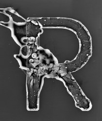
R/Photogram Study
R/Photogram. (Although my photogram studies may look like Photoshop or coding magic, they are actually the product of numerous hours in the darkroom. The prints are scanned and only lightly edited to remove things like dust and fingerprints.
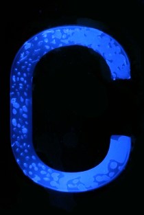
R/Photogram Study
R/Photogram. (Although my photogram studies may look like Photoshop or coding magic, they are actually the product of numerous hours in the darkroom. The prints are scanned and only lightly edited to remove things like dust and fingerprints.
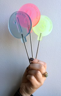
AIGA Nuts + Bolts /// Edible Type Awards
A few photos from the 2015 Edible Type Awards! Congrats to Aubrey (Bodoni o, 1st), Ian (Garamond i, 2nd), and McKinley (Chatype y, 3rd). They took home the coveted stainless steel/resin sucker trophies! A big round of applause for all
AIGA Nuts + Bolts /// Edible Type Awards
A few photos from the 2015 Edible Type Awards! Congrats to Aubrey (Bodoni o, 1st), Ian (Garamond i, 2nd), and McKinley (Chatype y, 3rd). They took home the coveted stainless steel/resin sucker trophies! A big round of applause for all
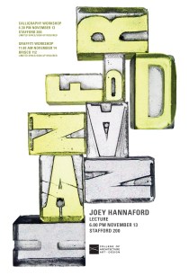
JOEY HANNAFORD POSTER
Joey Hannaford is a very talented designer/artist. You should check her out!

BUILD IT UP TO BURN IT DOWN
I cast a full set of bronze Univers Condensed brands to create this branded poster. The challenges of branding yielded a lot of serendipitous results. Heating the brands evenly is difficult, and the threshold between burning paper and igniting paper
BUILD IT UP TO BURN IT DOWN
I cast a full set of bronze Univers Condensed brands to create this branded poster. The challenges of branding yielded a lot of serendipitous results. Heating the brands evenly is difficult, and the threshold between burning paper and igniting paper
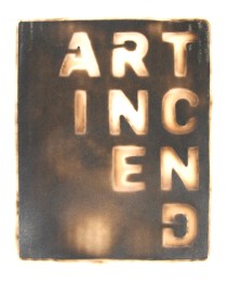
Brand/Art Incend
Many thanks to Daniel McMillan (advanced sculpture student) and Kevin Shunn (Chair, Department of Art) for their help with converting my logotype into a brand.
Brand/Art Incend
Many thanks to Daniel McMillan (advanced sculpture student) and Kevin Shunn (Chair, Department of Art) for their help with converting my logotype into a brand.

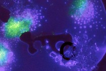
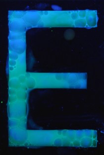


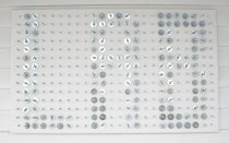
B/Experiment
Typographic explorations with slime mold.

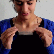
BE BOLD/Typographic Thaumatrope Pendant
Be Bold is a typographic thaumatrope. The horizontal and vertical strokes of geometric letterforms exist on opposing sides of an aluminum pendant. Only through spinning the pendant does the piece confide its secret message. I’m currently working on silver/enamel versions.


PROJECT M/The Lab Sign
Shortly after graduating in 2008, I attended Project M, a month-long annual program that brings creative volunteers and advisors from all over the world together to collaborate and design for the greater good. In June of 2008, the Project M
PROJECT M/The Lab Sign
Shortly after graduating in 2008, I attended Project M, a month-long annual program that brings creative volunteers and advisors from all over the world together to collaborate and design for the greater good. In June of 2008, the Project M
